Indeed Re Design App
Problem
As a student job seeker, I found Indeed’s navigation overwhelming, making it difficult to find relevant opportunities.
Solution
I redesigned the platform with a more intuitive and user-friendly interface to enhance the job-seeking experience.
Why Indeed?
I first opened Indeed one night as I applied for a student job. I felt overwhelmed: too many tabs, confusing navigation, filters hidden behind menus. It struck me — if I a UX-design student felt lost, many others must too. That’s what led me to this redesign
Re-Design

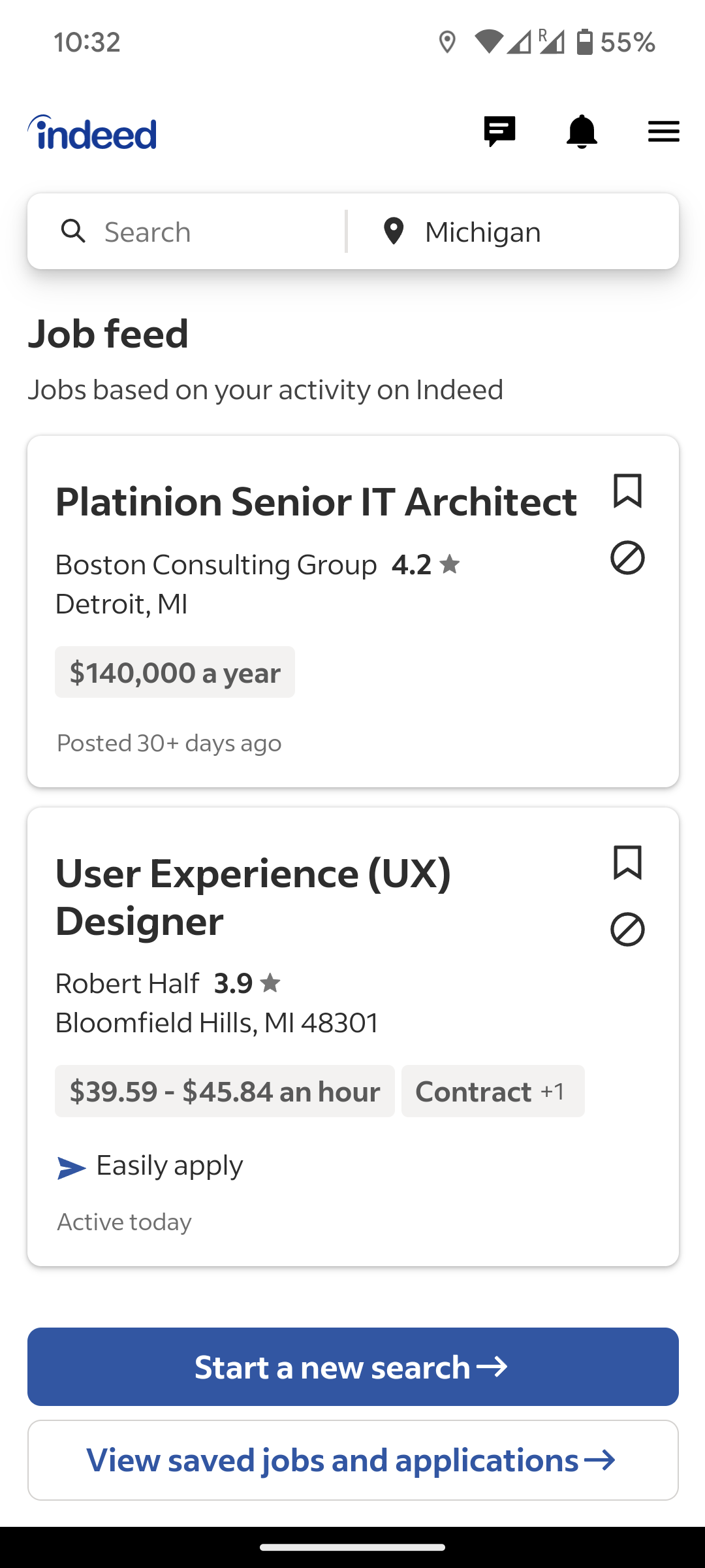
Original
-
UX Researcher, part of a team of 3 (2 designers, 1 researcher)
-
Jan 2025 – Apr 2025 (4 months)
-
User interviews, surveys, usability testing, competitive analysis using Figma, FigJam, Miro, and UserTesting.
Project Details
User Research
Mapping tasks showed that users needed 5–6 steps to perform something as simple as filtering jobs by location. Accessibility testing also revealed that users who increased text size lost visibility of key buttons. Both issues reinforced the need for a cleaner navigation model.
System Analysis

Detailed analysis of navigation, search, & interface revealed user experience strengths.
Identified areas for improvement: filter customization & profile management.
Task Analysis
The task analysis for the Indeed app showed users basically want efficiency in executing direct searches, wherein they want results fast and correct based on the keywords and location.
Profile and resume management, for both employers and candidates, require seamless integration to manage job listings and search candidates by criteria like salary, while job browsing demands easy navigation and effective filters.
User Analysis
For user analysis, we created detailed personas of the Indeed app's existing user base, representing job seekers, employers, and recruiters.
These personas helped us understand user goals, pain points, and behavior patterns to enhance the app's user experience.
Key Findings
Re Design
After(Re design)


Before


Process
Task Analysis
We conducted two detailed task analyses focusing on the main tasks Browse Jobs and Navigation comparing the old and redesigned interfaces to identify pain points and showcase improvements in usability and flow.
Task 1- Browse Jobs


Task 2- Navigation


Check out my other Projects

